Lowell, Massachusetts, was where their first sober house for men dealing with alcoholism was established. Over the next 51 years, Lowell House expanded its reach and services to help even more communities across Merrimack Valley and provide residential treatment centers, an outpatient clinic, outreach services, peer recovery support, and recovery homes. The organization wanted a rebrand to reflect its expanded services and reach. The Ladybugz team knew how vital the rebrand would be to the organization and because of its history and recognition across the State. The new name and logo needed to capture the “road to recovery” essence while honoring the nonprofit’s historic roots in Lowell as a sober house. It was a big decision for the organization, so our expert content team at Ladybugz began renaming with the Lowell House team.
After presenting the team with multiple concepts that included a new name and tagline, Riverbend was the winning name. The idea of the river quickly emerged as a favorite among the team and with board members. The idea that the road to recovery is never straightforward; it ebbs and flows, is continual, and is sometimes smooth and sometimes rocky illustrates a lifelong journey of recovery beautifully. The chosen tagline, “Empowering Life, Healing and Independence Since 1971” honored the history of formerly known LHI or Lowell House Incorporated with the subtle Life, Healing, and Independence acronym to tie it all together.
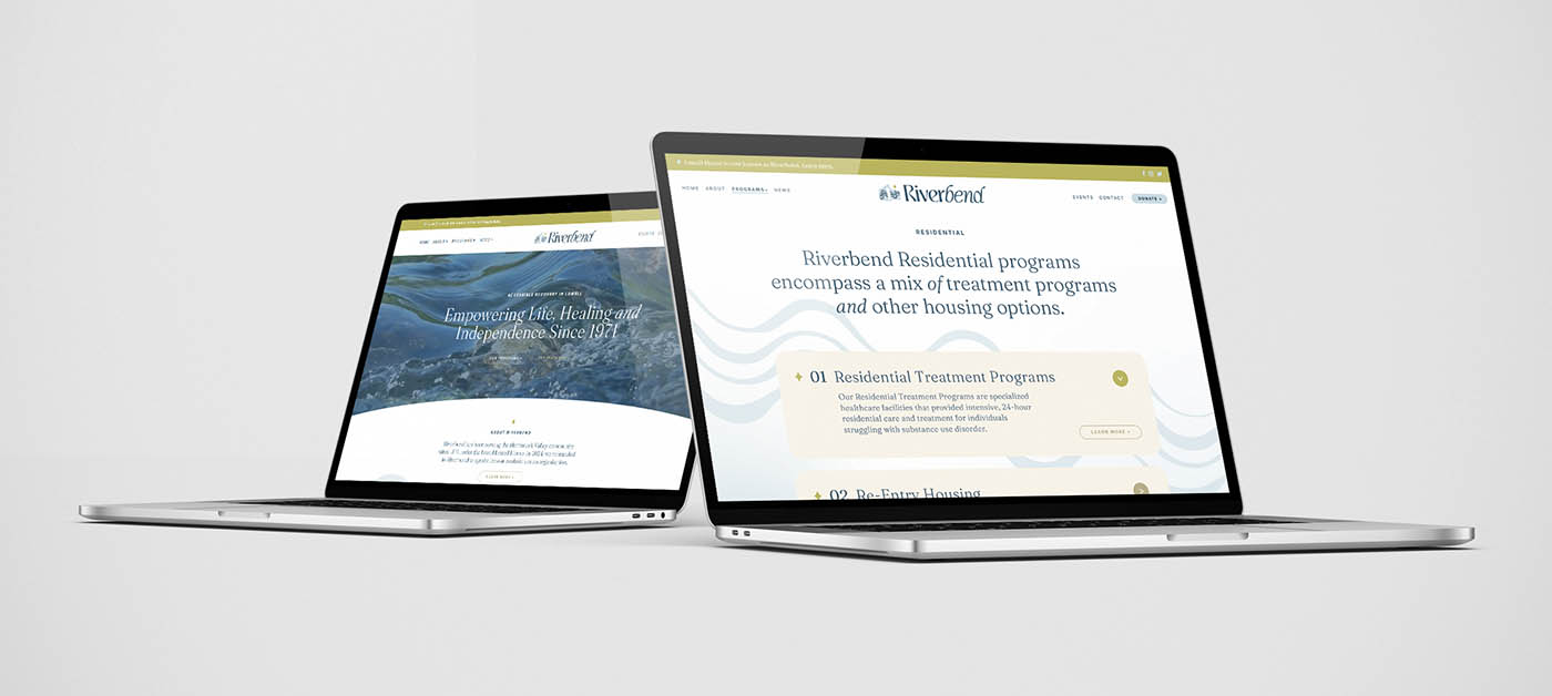
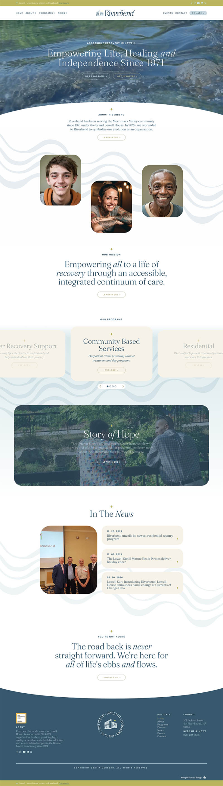
The Ladybugz expert design team then took the chosen new name Riverbend and tagline and created an approachable and welcoming visual brand that included a logo design with a whimsical font type and accents that mimicked the flow and curves of a river. The icon further reinforced the river concept with graphical water elements across a house image to again pay tribute to their past logo, name, and history. In the top hero space of their new homepage website redesign, a video of running water played to bring in a dynamic contrast with an intriguing element of subtle movement. Visual elements from the icon, including the river graphics, were incorporated throughout the entire website redesign, in addition to soft corners around images and buttons to create a warm and welcoming feeling. Messaging reinforced their expanded suite of services offered across Merrimack Valley and further conveyed that recovery is a life-long pursuit, not a destination, and that Riverbend is there for it all.